Restaurant Menu Examples: 10 Designs That Sell More
See 10 restaurant menu examples and the design choices behind them, plus the principles that make a menu sell more of what you want to serve.
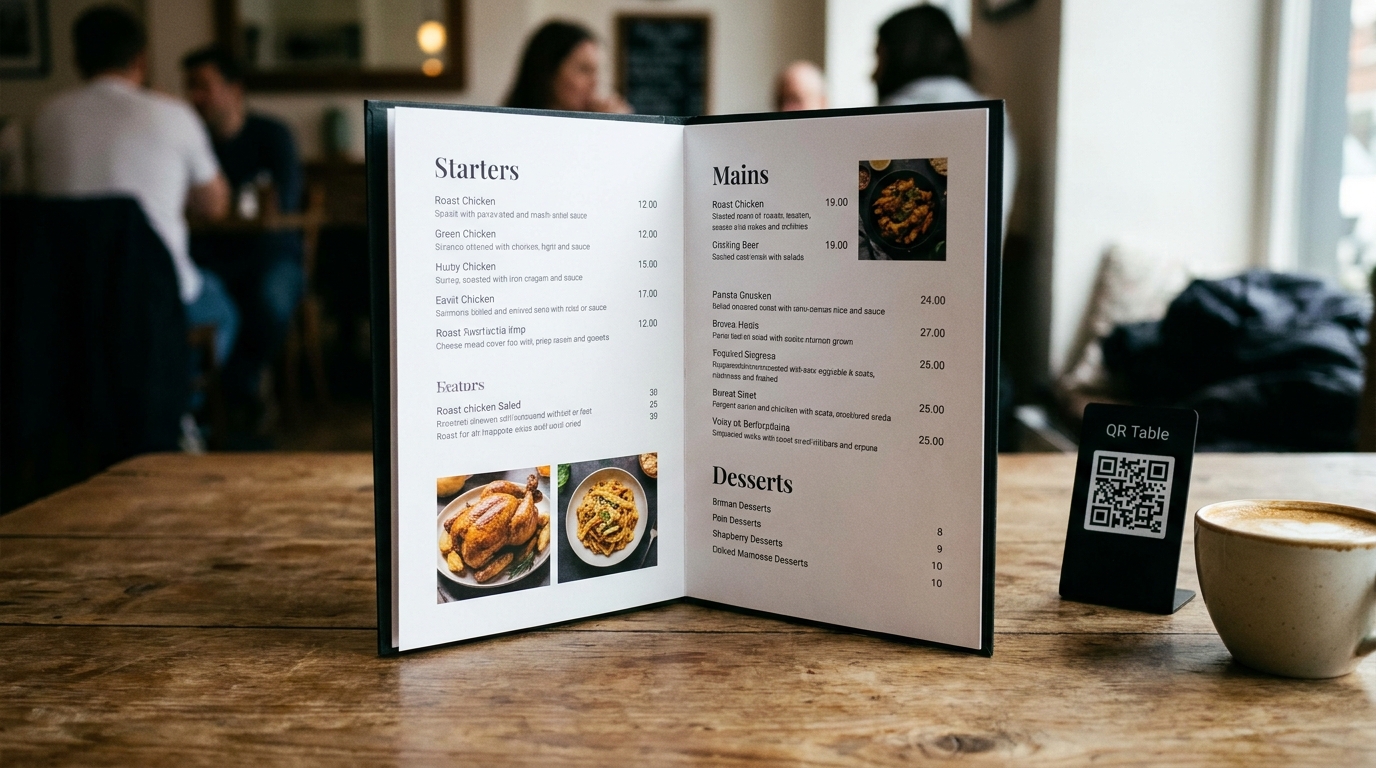
Most restaurant menus are written before they are designed. The owner lists the dishes, sets prices that feel fair, and moves on. Then the kitchen wonders why the $9 pasta outsells the $24 short rib that took three days to braise.
A menu is not a document. It is a sales tool. The way you group dishes, place prices, describe flavor, and guide the eye decides what guests actually order. When you study strong restaurant menu examples side by side, the same handful of design decisions show up again and again. That is the good news: none of them require a design degree or a big budget.
Below are 10 restaurant menu examples worth learning from, why each one works, and the specific move you can borrow for your own menu this week.
What Separates a Great Menu From an Average One
Before the examples, it helps to know what you are looking for. Almost every menu that sells well does these five things:
- It is easy to scan. Guests decide in seconds. Clear sections, bold dish names, and short descriptions beat clever layouts.
- It puts profitable dishes in high-traffic zones. The center and top-right of a menu get read first. Your best earners belong there.
- It makes the food sound worth ordering. Sensory language ("charred," "slow-roasted," "citrus") moves dishes. Generic words ("fresh," "delicious") do nothing.
- It earns more per guest. Add-ons, pairings, and one well-placed anchor item raise the average ticket without discounting.
- It works on a phone. The majority of your guests read the menu on a screen before they ever sit down. If it does not work there, it does not work at all.
Keep those five filters in mind as you look at each example below.
10 Restaurant Menu Examples (and What to Steal From Each)
| # | Example Style | Best For | The Move to Steal |
|---|---|---|---|
| 1 | Classic Diner Two-Fold | Breakfast, all-day cafes | Category headers that speed scanning |
| 2 | Steakhouse Leather-Bound | Fine dining, high check average | One anchor price, no dollar signs |
| 3 | Small Plates Grid | Tapas, shareable concepts | Grouping that encourages more orders |
| 4 | Bowl Builder | Fast casual, made-to-order | A guided choice path that upsells |
| 5 | Single-Hero Photo Menu | Burger joints, casual dining | One appetite photo, not twenty |
| 6 | Seasonal One-Pager | Farm-to-table, rotating menus | A short menu that protects margins |
| 7 | Cafe Counter Card | Bakeries, coffee shops | Add-on rows that trigger impulse buys |
| 8 | Pizza Size Matrix | Pizzerias | Pricing architecture that adds revenue |
| 9 | Bar and Cocktail Menu | Bars, restaurants with a program | Flavor descriptors that sell drinks |
| 10 | Digital Web Menu | Every restaurant | A fast, tappable, searchable menu |
1. The Classic Diner Two-Fold
The diner menu is the workhorse of the industry: two laminated pages that open like a book, organized into breakfast, sandwiches, platters, sides, and desserts. It is not elegant, but it is fast.
Why it works: The category structure mirrors how hungry guests think. Someone scanning for a burger goes straight to the sandwiches panel and stops searching. Familiarity reduces decision fatigue, which means faster ordering and higher table turns.
What to steal: Use plain, bold category headers, and keep dish names on the left with prices tucked at the end of the line rather than in a neat right-hand column. That single change discourages price-shopping down the list and nudges guests toward what sounds good.
2. The Steakhouse Leather-Bound Menu
Fine dining menus often do less, not more. A steakhouse menu might list eight cuts, a handful of sides, and a few classic starters, all set in clean type with no photos and no dollar signs.
Why it works: Restraint signals confidence. Listing fewer items at higher prices tells guests the kitchen stands behind everything. The absence of currency symbols is deliberate: "42" reads like a price point, while "$42" reads like a bill.
What to steal: Anchor the top of the menu with one high-priced item. A $95 tomahawk makes the $48 ribeye look reasonable. You do not need to sell many anchors; their job is to reframe everything below them.
3. The Small Plates Grid
Tapas and shareable-concept menus group eight to fifteen small dishes into a clean grid, often with a note like, "Order two to three per person." The grid format makes browsing feel like a tasting adventure rather than a checklist.
Why it works: The format teaches guests how to order, which raises the number of items per table. When a server does not have to explain the concept, guests order more confidently and order more items.
What to steal: Add a gentle ordering cue. "Most tables share three or four plates" is one line that reliably increases items per cover without any hard sell.
4. The Bowl Builder
Fast-casual menus built around a bowl or burrito use a step-by-step layout: pick a base, pick a protein, add two sides, choose a sauce. Each step is a column, and each upgrade carries a small premium.
Why it works: It turns ordering into a guided path. The guest is making decisions instead of hunting for a dish, which speeds the line and raises the average ticket through natural add-ons.
What to steal: Structure your combos as steps, and make the first paid add-on feel like a normal part of the meal. A "$3 avocado" reads as a choice; an upsell invented at the register reads as pressure.
5. The Single-Hero Photo Menu
Some of the best casual menus use exactly one photograph: a burger with visible char, cheese pulling, fries just out of frame. Everything else is text.
Why it works: One great food photo creates appetite and directs attention without slowing the read. Photo-heavy menus that show every dish do the opposite: they look like a catalog, load slowly, and give every item equal weight, which means none stands out.
What to steal: Choose your single most profitable Star dish and give it one strong photo. If you do add more photos, keep them to a small handful and make sure they are sharp, well-lit, and shot with real dishes from your kitchen.
6. The Seasonal One-Pager
Farm-to-table restaurants often run a single page that changes with the season: six starters, six mains, a couple of desserts. Items rotate in and out as ingredients peak.
Why it works: A short menu is a profitable menu. Fewer items mean lower food waste, faster prep, and more attention on each dish. It also gives regulars a reason to return.
What to steal: Treat menu length as a cost decision, not just a design one. Every item you cut removes prep labor, storage, and the chance a guest stalls over a page that is too long to read.
7. The Cafe Counter Card
Coffee shops and bakeries lean on a small counter card and a pastry case. The card lists drinks in a tight column, then a bottom row of pastries, breakfast sandwiches, and add-ons.
Why it works: The add-on row catches guests at the exact moment they are deciding how much to spend. Impulse items placed next to the register convert because the decision is easy and immediate.
What to steal: Give your highest-margin, lowest-friction items a dedicated row or panel near the point of decision, whether that is the register, the online checkout, or the cart page.
8. The Pizza Size Matrix
A strong pizzeria menu separates the base pizza from its add-ons with a clean table: size across the top, toppings and prices down the side. Specialty pies get their own list above the build-your-own section.
Why it works: The matrix makes pricing transparent and comparisons easy, which builds trust. It also quietly upsells: a guest ordering a large sees the two-topping combo price right there and often takes it.
What to steal: If you sell in sizes or tiers, show them together. Clear upgrade pricing converts better than a single price with "ask about sizes" buried in the fine print.
9. The Bar and Cocktail Menu
Cocktail menus have moved toward flavor-first design: drinks grouped by mood ("bright and citrusy," "stirred and spirit-forward") with short tasting notes and no ingredient dump.
Why it works: Guests do not always know a spirit by name, but they know whether they want something smoky or refreshing. Describing flavor instead of ingredients lowers the barrier and sells more drinks per table.
What to steal: Apply the same logic to food. "Charred citrus chicken with a smoky chili glaze" tells a guest what the dish tastes like. "House chicken" tells them nothing.
10. The Digital Web Menu
The most important restaurant menu example of the decade is not printed at all. It is a real web menu on your own site: mobile-first, fast, and easy to update the moment a price or dish changes.
Why it works: Diners find you on their phone, usually through Google, and decide where to eat before they leave the house. A clean web menu is readable on a small screen, loads in under a second, and gets indexed by search engines, so it keeps working after guests arrive.
What to steal: Replace any PDF menu with a real HTML menu. PDFs are invisible to search, painful to pinch and zoom, and impossible to order from. A web menu connects directly to online ordering and analytics, which is the whole point.
The Design Principles Behind Every Strong Example
Once you see the patterns, they are hard to unsee. These are the choices that do the heavy lifting across all ten examples:
- The golden triangle. Guests read the center of the menu first, then the top-right, then the top-left. Put your highest-profit Stars in those zones.
- Price placement, not price competition. Prices lined up in a tidy right-hand column invite comparison shopping. Placing them at the end of the description keeps guests reading the dish.
- Taste words over adjectives. "Crispy," "slow-roasted," and "charred" move items. "Delicious" and "fresh" are filler guests already assume.
- One anchor item. A single high-priced dish reframes the rest of the menu as value.
- Descriptions that sell, not explain. Two lines of sensory detail beat four lines of ingredients.
- Fewer items, better margins. A short menu lowers waste and raises average contribution per dish.
- A strong digital home. The menu is the page guests read on their phone and the screen they order from. Speed and legibility there matter as much as any print choice.
A Menu Checklist You Can Run This Week
1. Export your sales mix by item from your POS for the last 8 weeks.
2. Note food cost per dish and rank dishes by contribution margin, not markup.
3. Identify which dishes are your Stars (high profit, high popularity) and move them into the golden triangle.
4. Place prices at the end of descriptions and remove dollar signs.
5. Add a single anchor item near the top.
6. Rewrite descriptions with sensory, taste-driven language.
7. Cut the bottom performers to shorten the menu and reduce waste.
8. Add a photo of your single best-selling Star dish.
9. Replace any PDF menu with a fast, mobile-first web menu.
Run the version for four to six weeks, then re-measure. Menu design is a loop, not a one-time project.
Why Your Menu's Best Home Is Your Website
A printed menu only works once a guest is already seated. Your website menu works all day, for every local search that happens on a phone. That is where a huge share of your orders are actually decided.
A real web menu gets indexed by Google, updates in seconds, loads instantly on mobile, and connects directly to online ordering. A PDF menu does none of that. It hides your dishes from search, frustrates guests on small screens, and sends them straight to third-party delivery apps that take a cut of every order.
If your menu lives in a PDF or a photo on social media, that is the single cheapest fix available to you.
Where We Fit In
We build and host fast, modern restaurant websites at no cost, with real web menus that are easy to read, easy to update, and easy to order from. There are no monthly fees and no credit card required. If you ever want direct, commission-free online ordering, we offer SendFoodOrder as an optional add-on. If you never need it, your website stays free.
To go deeper, see how menu engineering works, why PDF menus hurt your search visibility, and what a restaurant website really costs.
Ready to give your menu a better home?
Free Website Offer
Get a modern website for your restaurant with zero cost and no monthly fees
We design and host your menu, hours, and photos on a custom domain. Keep 100% of your food sales, with optional online ordering when you are ready.